
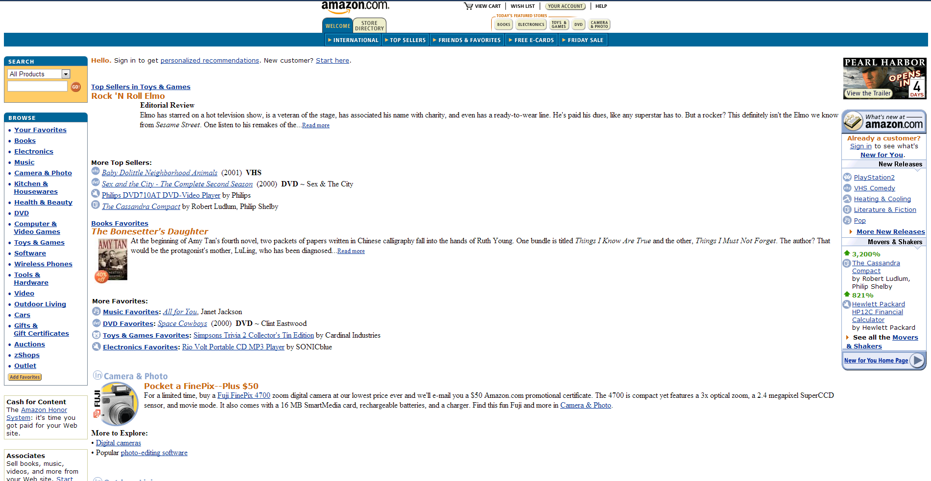
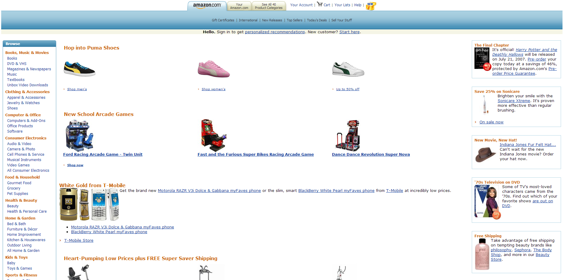
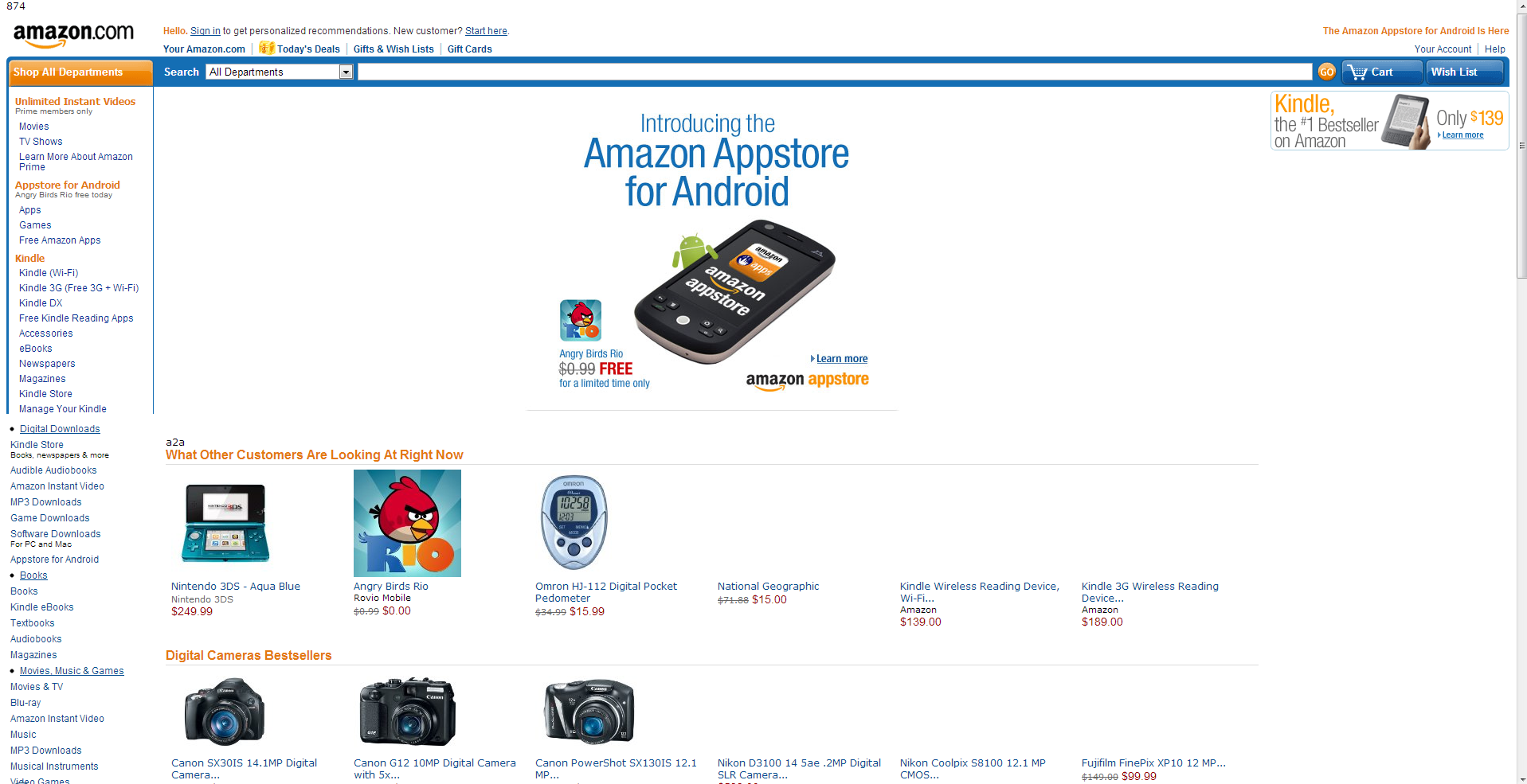
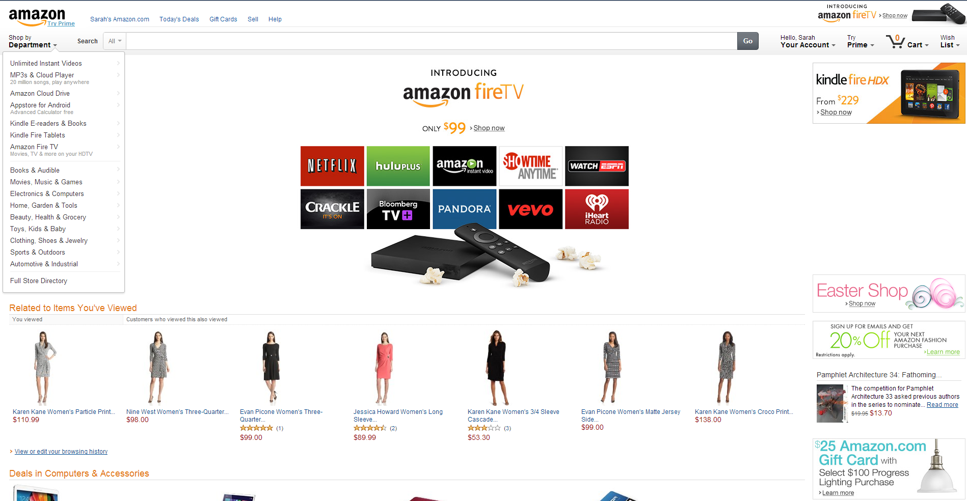
As you've probably gathered by now, I'm a nerd. I'll admit it. But because of that I'm really hopeful for how Architectural Representation can work with website design and help find new tools to tell stories with. It only took about 15 years to get Amazon's site from A to B as shown below.

Fortunately, many design oriented industries have already found creative applications of online mediums. A site called We Choose the Moon was made in an attempt to recreate the way Americans felt in 1969, watching the Lunar Landing. It quickly teaches the viewer how to use the site as it loads, then engages the viewer with an HUD and smaller icons to provide more information.
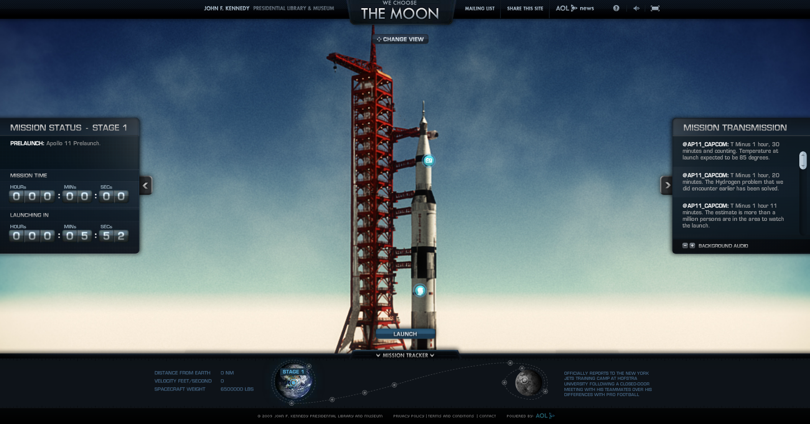
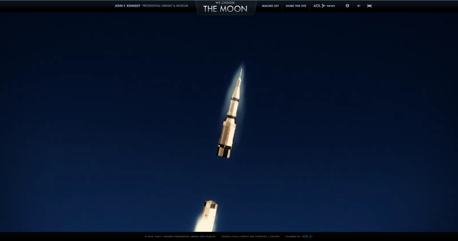
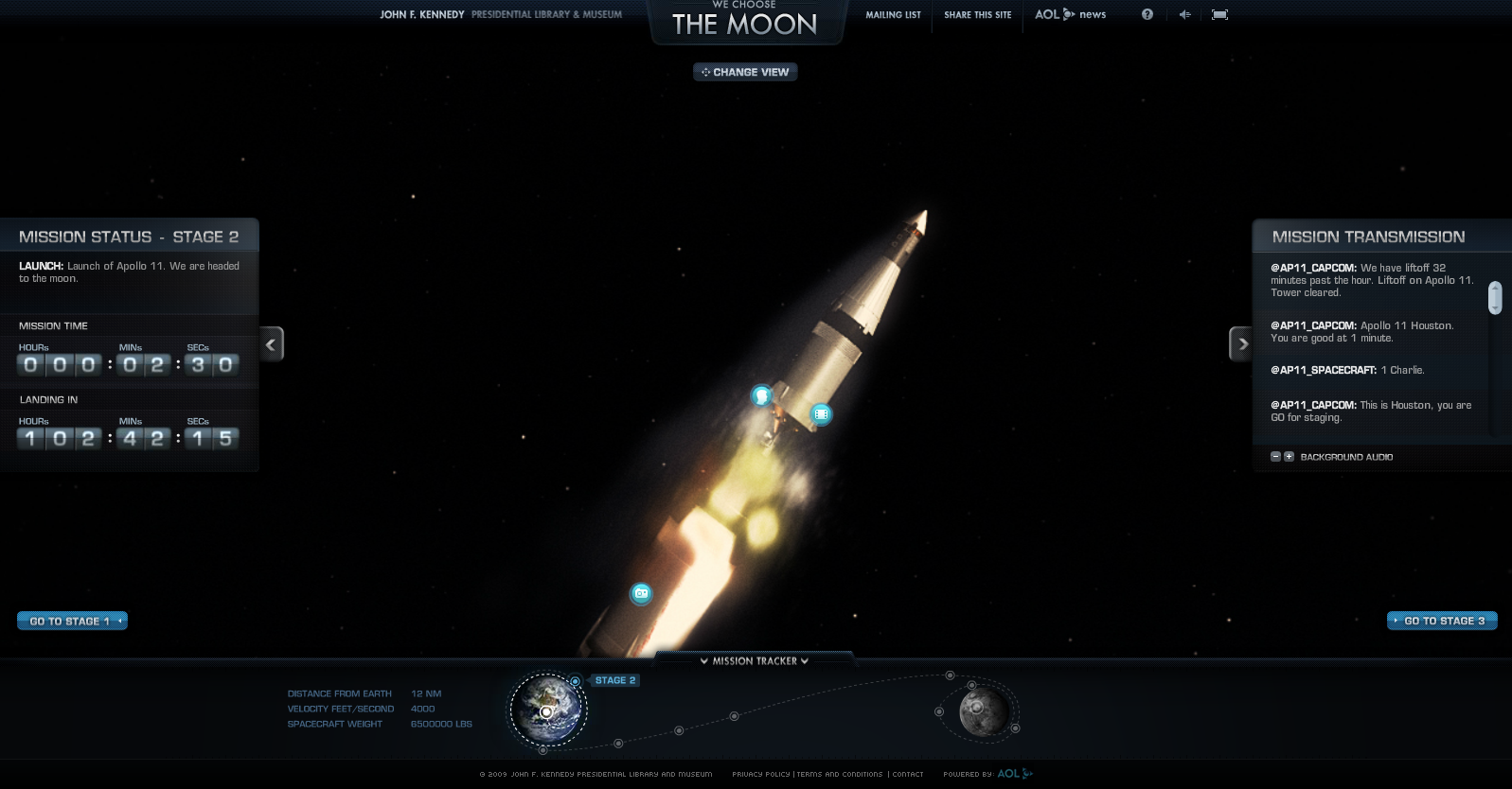
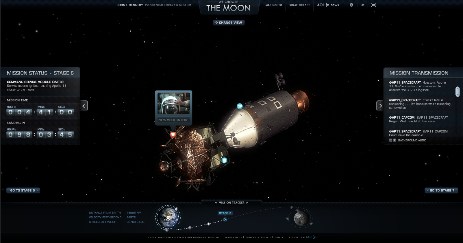
The site plays recordings from NASA as the viewer goes through the different stages of the launch with a Mission tracker on one side and a transmission (twitter style) so that the viewer can really grasp how rehearsed and precise every moment of this process was.
Realizing that there are now a lot of people who didn't get to watch the original broadcast, The John F. Kennedy Museum created this site. It's a creative and interactive way for a younger audience to be excited about space-travel. It's exciting, gets the user to interact with it, and most of all, it tells a story.

Maybe not so fortunately, online superpowers like google have found ways to track human interaction with websites. These show where my website's views are coming from. This is available to any person who owns a site.
Let's not dwell on google taking over the internet, let's look at ipads instead. Apple is fantastic at quickly providing what the user wants then integrating what they want to show to the user.
Recurring themes start to emerge like "BUY THE IPAD" and "SHOP HERE FOR THINGS". Clearly these are marketing tricks, but the takeaway is that understanding how people use websites is valuable to finding success with this medium.
The site has a 10 second window of time to entice the user to stay. The average person will decide whether or not to invest time in the page within 10 seconds.
The implementation of this looks sort of like a trojan horse. The user gets what they wanted from the website immediately. A good website will then incorporate exciting or relevant information to keep the user from wanting to leave or getting distracted.

Blogs like ArchDaily don’t abide by these findings. The front page can’t direct a user to a single interest and ads are mixed in so cleverly, the user can easily get directed out of the site. The diagram shows orange as self promotion and red is an ad to an outside site. Due to these factors, repeated usage is not rewarded to one of architecture’s few educated online resources.
Small blogs benefit from this, without value to consistent viewership, they’ll post articles quickly and with the most viral pieces of the press kit. When a project proliferates without the tailorship of an architect, it could weaken public opinion of it.
Especially if the article was written by someone outside the field, with no attempt to understand the project beyond the renderings.
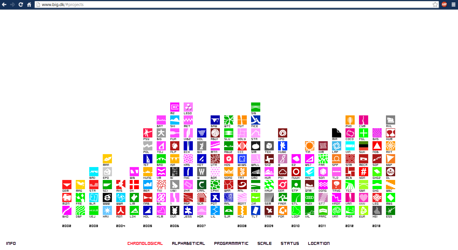
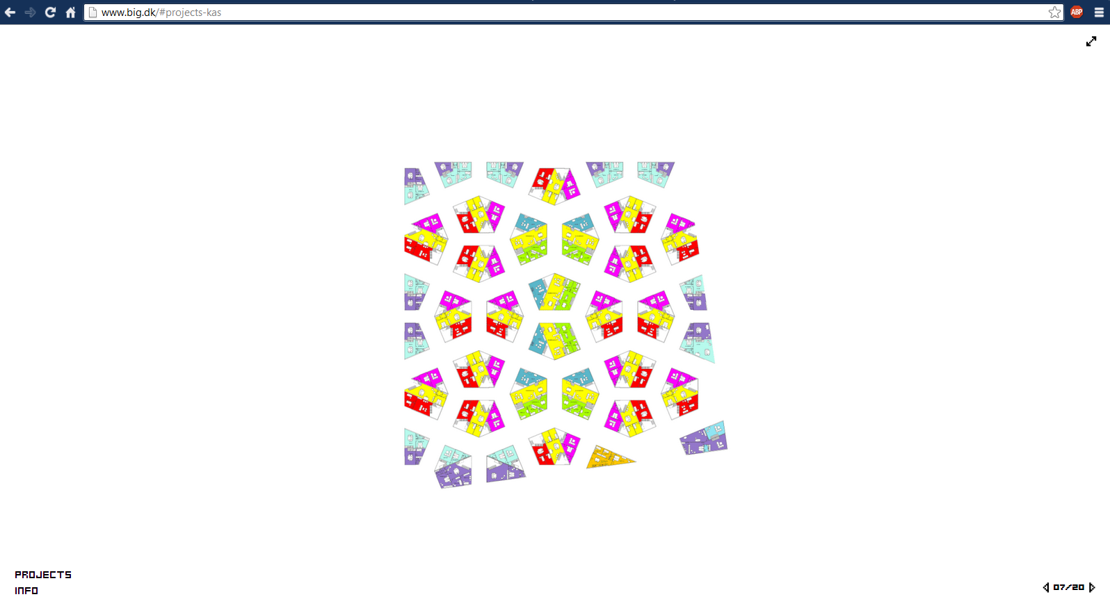
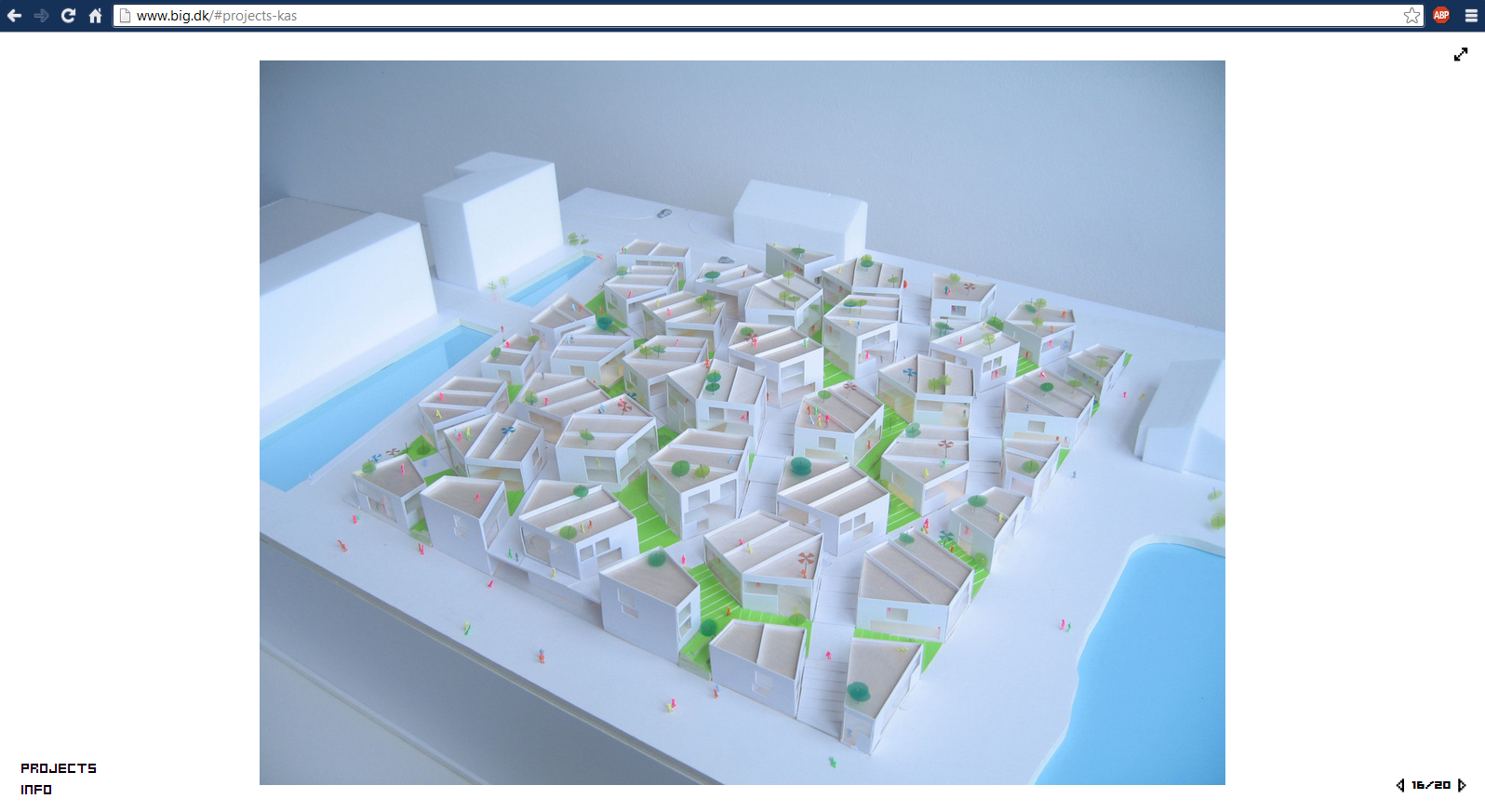
Bjarke Ingels Group works very hardto publish every idea they've ever had.
Because they've made their concepts and process so accessible, they are easy to critique.
Clearly their website intrigues architects, as is supported by multiple references of it showing up in talks. It correlates with the rest of their publications, they didn't slack here. It supports their attitude toward accessibility and interest in the general audience. Everything is made available to you on the front page.
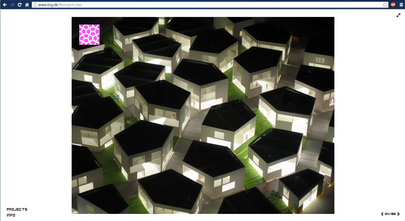
The icons then open up a window with a photo that which provides a visual correlation to the logo.
We then get an information page, after the 10 second mark, you’ve already clicked twice, and you’re officially invested.
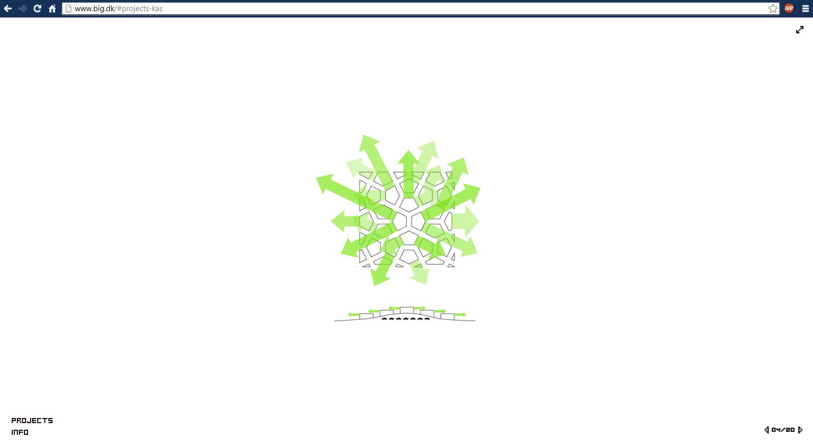
The user is now curious. The information given is no longer what the user originally set out to find. Diagrams explain what the architect wants the user to know.
The diagrams get more complex as the user becomes more knowledgeable about the design. Which rather fantastically, undergo a seamless transition from diagrams to line drawings.
After understanding the concept, BIG reveals the presentation materials. This serves as a teaching tool as well as a way to guide the user to think like an architect.
Lewis Tsurumaki Lewis has a different story to tell, one about spatial relationships and clever solutions to volumetric problems. We'll start with the representational documents used to describe the New Taipei City- Museum of Art. The abstracted floor plate drawing uses subtle colors to describe light and visually separate program. Small captions provide information about program types in lieu of complicating the drawing with interior walls.
The next drawing I'll show you is a rendering. Concerned with colors and not materials, patterns and generic shadingare superimposed on a hand sketch. People are added hastily (transparent and not entirely matching perspective) to speculate on usage of the space.
The section perspective gives this architectural way of looking at the project, but a completely artistic understanding of the interior. By informing a section, which is foreign to the general audience, with a familiar perspective style drawing, the viewer can easily to see correlations between spaces.
And we have another rendering which shows an assembly space.
Paired with the previous drawing, this rendering is now recognizable as the assembly space in the middle. By providing multiple views which can easily be matched together, LTL ensures that the shape of the space can be comprehended.
By using these documents in tandem, we can see that open expanses are important. Sightlines to different programs are also emphasized.
These two findings explain why built in elements and details imply a continuous path without termination. By using recurring features through multiple drawings and omitting overwhelming information, the drawings can work together. For the architect to take control over the forum in which a project is discussed in is very important. Architecture is an expansive field, to master every facet of it is not typical, but always expected somehow. Representation of the project can be used to emphasize the strong points which are passionately deliberated over.
So then there's a new story to tell, what if, by layering the drawings, the building reveals something different. Similar to the way we use trace paper, what if renderings could be broken down into their layers on the website. Showing the structure and the floor plan together, or swapping the floor plan to show the exterior of the building instead. That sounds a million times more engaging than a few sentences.
Okay so this is the part I'm not so sure will function for a universal audience, but I feel like it'd be amiss for me to not discuss it. Every other means of storytelling thus far have been centered around using graphics we already make in order to enhance understanding. This one requires many frames to be drawn of a variety of subjects, so it's more or less a gamble when considering time allotment. Graphic novels are something that I find engaging and also really great at telling stories of varying complexity. A child and an adult can read the same thing and get two entirely different stories. Since it can get symbolic messages across without relying on operational knowledge, it can easily start a discussion which anyone can join into, I love that. What if Architectural Theory could be that infectious to a general audience?
Jimenez Lai’s Citizens of No Place walks an average person through complex architectural arguments in an abstract environment. It’s easy for the reader to come to their own conclusions as opposed to trusting every word as golden. It allows the reader to evaluate and question. These qualities, along with the relatable medium of the graphic novel, foster an interest in the project.
The graphic novel is inherently good at breaking down concepts by providing illustrations and text which work in tandem to present an idea. It’s a choreographed and tailored method of ensuring that the intended words stick with the specific images. Which is more or less what we’ve always used; graphic elements which can be deciphered by using captions and notes.
Looking forward I think it would be valuable to explore unconventional website designs in favor of tailoring high level information in a way that can start to be understood by a general audience. So instead of having a website which documents what I did to draw a building, I want to find a way to show how I designed a piece of Architecture. I'd like to propose four different website styles which tell different stories about my projects.