A Story About Visual Communication
While at Callison, I was asked to talk about my passions as a young professional in the field of architecture. I was fortunate enough to be afforded this opportunity and am very thankful to all who attended. Here is a transcript of the talk with a few images.
Knowlton School of Architecture (c) Dwell Magazine
I had apparently always wanted to be an Architect, which seems like an odd thing for a kid to cling to. But that was me and I went to The Ohio State University, but most importantly, I lived in the Knowlton School of Architecture. I got my undergraduate and Graduate degrees there. Which shocked me too. I had planned to get out of there after four quick years. The building was never the right temperature, the finishes on the concrete weren’t consistent, reverberation time was much longer than most buildings on campus, and the list went on. So for three years of undergrad, I actually couldn't stand the building. That is, until someone told me about the concept. It was supposed to act as a theater.
And I got it- the space was designed for passive learning and interaction between students and staff. It built up the community between us because we constantly saw each other. The atrium acted as a unifying element between landscape, city planning, architecture students, and our staff. I was completely on-board after that one sentence. Because I had proof that it was a good building. It was designed tactfully. Unfortunately some elements suffered, but the trade-off was finally worth it to me.
So how do we give our clients that ah-ha moment where they have some kind of proof that the we got the best solution given the parameters. A lot of money and coordination is involved in creating architecture, we need to justify the moves we make. Mathematicians have it easy, with most problems you can rely on givens to justify the answer. To prove it, you just walk through step by step, using unalterable truths to explain each one.
Architects have givens too- but they're subject to uncontrollable variables like budget, politics, opinions, and schedules. So we just went from solving an equation to answering a story problem, warranting something more complex than a numerical solution. I see this as an opportunity to use graphics to provide a shorthand for complex ideas. For a good reference in visual story telling we can look at movies...
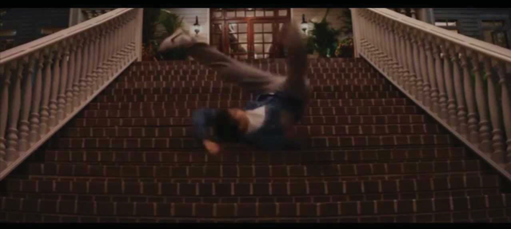
Wolf of Wall Street actually has a moment that illustrates this skill perfectly. The main character has to go down 6 stairs to get to his car. This scene acts like an exposition in a book does, unbiased and factual. Scorsese uses jump cuts to create a frantic state of mind to help the viewer relate to the main character. The monologue is equally unsettling in this scene- expressing an intent to visually build a relationship with the audience.
There is then a jump cut to this view, which shows him tumbling down 16 steps. This is Scorsese forcing the audience to sympathize with him. The best part: he maintains the velocity at the end of the 6 steps. It happened very quickly, but that step of putting the viewer in his shoes is something that narration couldn't achieve as palpably. It was a completely passive way to support the dialogue and plot at this point in time.
Wes Anderson has a more autonomous approach, everything in Grand Budapest hotel is either shot in 1 point perspective or some sort of makeshift planar shot.

In this moment in particular, the two main characters are being sent on a journey and at this point it is out of their hands. The final part of this trip is this surreal moment where they are transported via gondola lift in elevation. It is the ultimate of a controlled environment and this shot reinforces that by showing the track, cab and solitary launch and arrival locations.
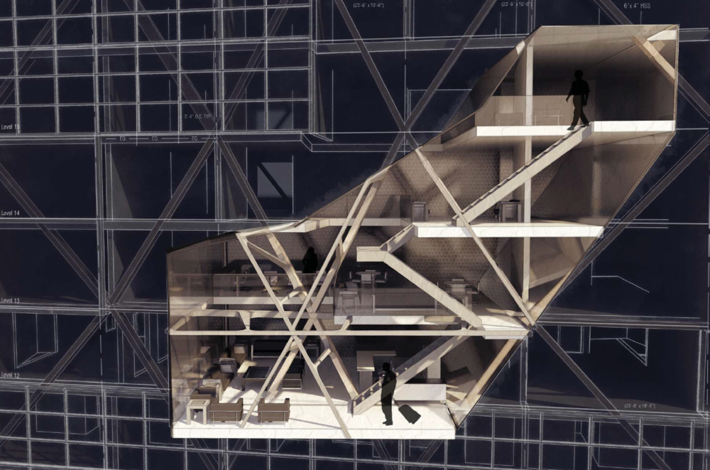
Films are masterful because they understand their toolkit and have a more direct path between ideation and realization. The necessity of visual communication is not new to architects, it's just challenging to maintain from schematic design to built result. Lewis Tsurumaki Lewis, expresses their style through the representation and realization of projects.

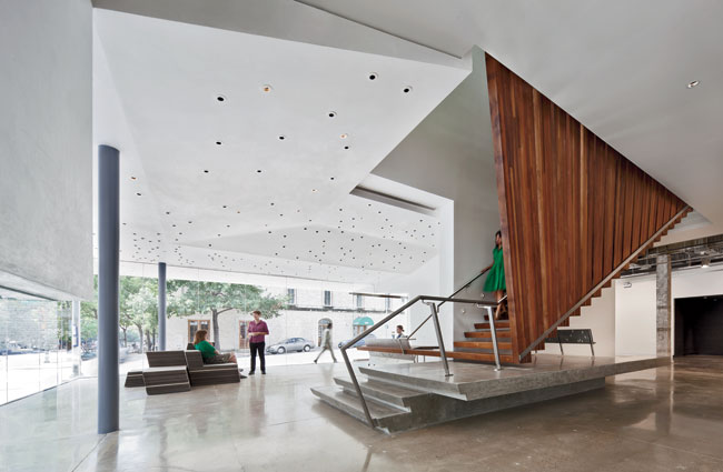
LTL’s Arthouse rendering shows the lower part of the stairs breaking through the cut plane. It reveals an origin story of the concept by including slightly more than expected.
In the built environment, we see that the wood transitions to stone at about desk height in order to create a datum. Then it literally turns into the counter top for the front desk. This draws attention to it as a moment and allows it to perform as the visual bridge which spans the gap between gathering spaces.
At first I struggled to just tell stories like this. I went through the motions during presentations and got all of my required drawings done. Until one teacher actually supported the digital art thing and had me present my boards with sketches that I'd done of the project. It was the first time I felt confident enough to deviate from the script.


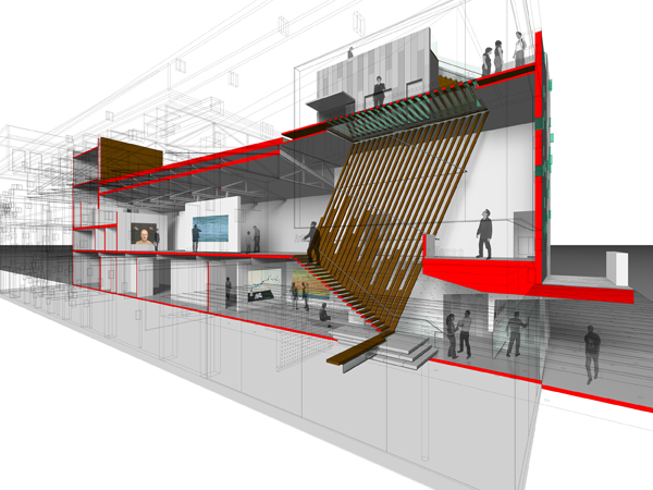
It took a solid three years to start working with rendering and digital art simultaneously. The result was getting more subtle. The comprehensive project was about putting new program into an existing building and modifying the structure to accommodate it.
The focus of this rendering was to contrast the new and old space. Another thing I wanted it to accomplish was establishing the structure as a design feature by removing the exterior glazing, but not letting the cut-plane affect the ribs which went through the space.
In my final studio project, I wanted to focus on microclimates and systems that could take advantage of them in form and material.

The focus of the rendering was then to exaggerate the variety of micro-climates and their traits by using color cues and textures. The supporting documentation maintains the color palette of the landscape, but with more contrast. By breaking the information into arrays and matrices, the varieties are easier to compare.
Leading up to my thesis and in tandem with my experiments on renderings, I studied storytelling tactics in graphic novels. This is where I really started to focus on camera angles as a story telling element. In my first two attempts, I really didn't have a ton of concept of camera. I just drew things to demonstrate plot points. After a while, I started to notice when an artist would foreshadow something using visual cues. It was something my stories seemed to be missing, which was the ability to trust the graphic to tell the other part of the story.