
Sketching is key to iterating quickly and failing fast
Running through the infinitely many ways to compose an idea can take some time. If it’s short, you may want to look for more inspiration, if it’s getting too long - just pick one, develop the skills and keep moving.
Translation from Text to Sketch
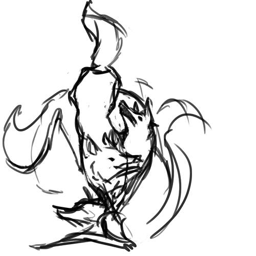
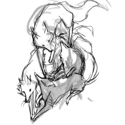
This one was particularly hard because my motivation was "Can I get a tattoo of a bear or a wolf or something?" which is both a blessing and a curse. On one hand, I have to do more work to figure out what exactly my client wants. On the other hand I have freedom to depict this my own way and can exceed expectation. Which is probably the most American way to view this problem.
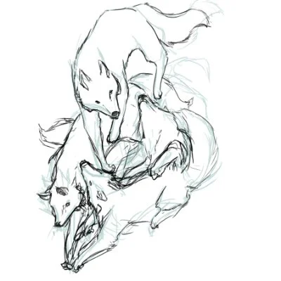
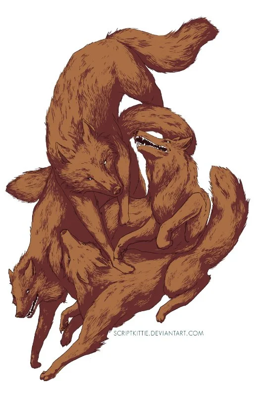
The struggle is visualized within the first 6 frames and starts to form into an understanding once I get to the actual pile of dogs drawing. The client was involved in clubs and communities when I knew him and has a very strong tie with family. The pack being depicted as a somewhat cohesive turmoil is the direction I wanted to take.
The next challenge was style, some people come to me expecting realistic or adorable things. I'm not a mind reader. From his first description, he wanted to take an alternative, more modern approach.
After talking to the client more and showing him options, he actually wanted them to look more realistic.

Production
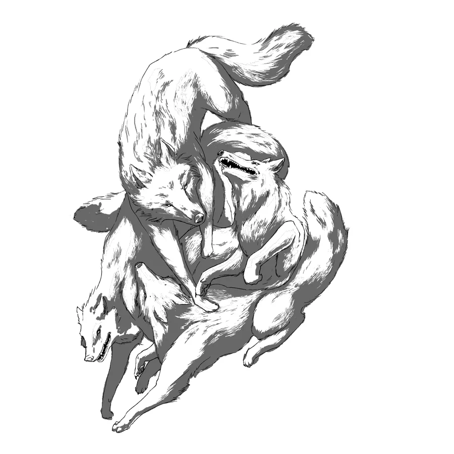
After the greenlight on the sketches, I went into inking. Which is by far my least favorite part of all of this.
Recently I've been using a round brush with pressure sensitive size, with texture to get rougher edges and dual brush to add variety.
If you've ever watched speedpainting or a digital artist do this step, it's the most tedious of all of them. I'll erase and redraw a line until it's ready then move on. I make sure all of the details are accounted for in this step due to the way the rest of the file is built.
The grey that you see above is actually its own transparent layer so I can change the color and tone later. If the colors are complicated, I'll set it to multiply instead and achieve a similar affect but have less control over the end result.
Coloring and Post Production
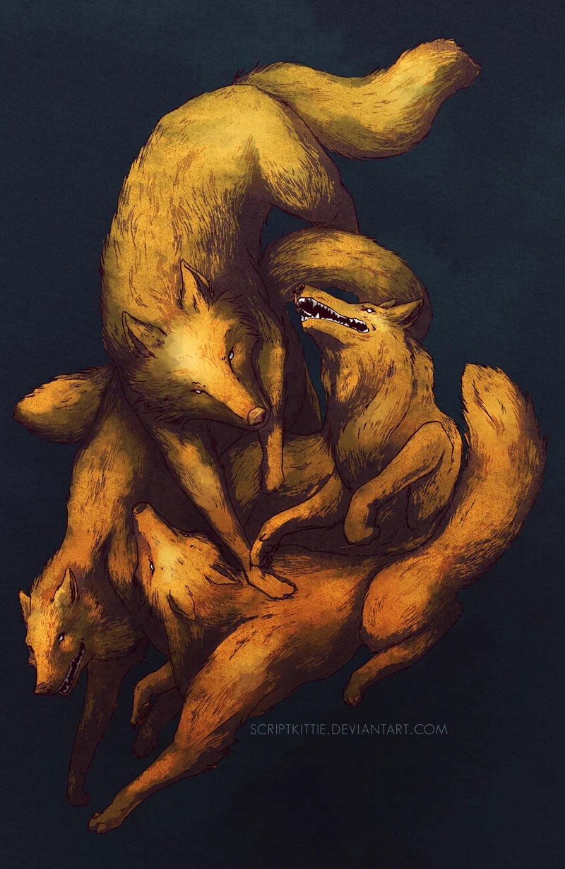
After the flat colors come in, I lock my layers and go to town with gradients and specific color combinations. I really like the contrast between yellow and indigo and felt like using that to build depth. In a similar vein, I typically like to use gradient washes to direct a change from the top to the bottom. Near the top, the image is very simple. As you start to see how the paws and heads are interacting between 4 different animals is where the picture gains complexity and a richer orange color.
I also overlayed a texture layer to bring variety into the clean and precise style resulting from the original ambition of "Tattoo Design".
I was taught via tutorials and over a decade of practice and I'm still learning. At the same time, it's nice to provide these little windows into certain styles. Digital artists share process information to each other often. Kind of like raising the bar by improving everyone around you.
Tools: Wacom Intuos 2 Tablet, Compy the Computer, Photoshop CS6
If you're looking to get into this kind of thing, I'd suggest a more modern operation. I've personally tested that yes, you could do equivalent work on Surface using Photoshop CC. I've seen others use iPads with ProCreate with great success.