
The Sum of Its Arts
Today's interactive Technology can be used to find a critical way to represent architecture to a general audience.
I'm focusing on the platform of technology because the internet is becoming the primary source for a first impression. The website is a tool made for the express purpose of being accessible. How architecture is discussed by this media is fascinating and has a lot of potential. So I’ll start with how people currently use websites to discuss Architecture and we’ll see where that takes us.
“10 Eye-popping new buildings that you’ll see in 2014” by CNN Style. Alright, CNN’s a reputable source, 21 thousand people have posted this on facebook, this is current and generally agreed upon.
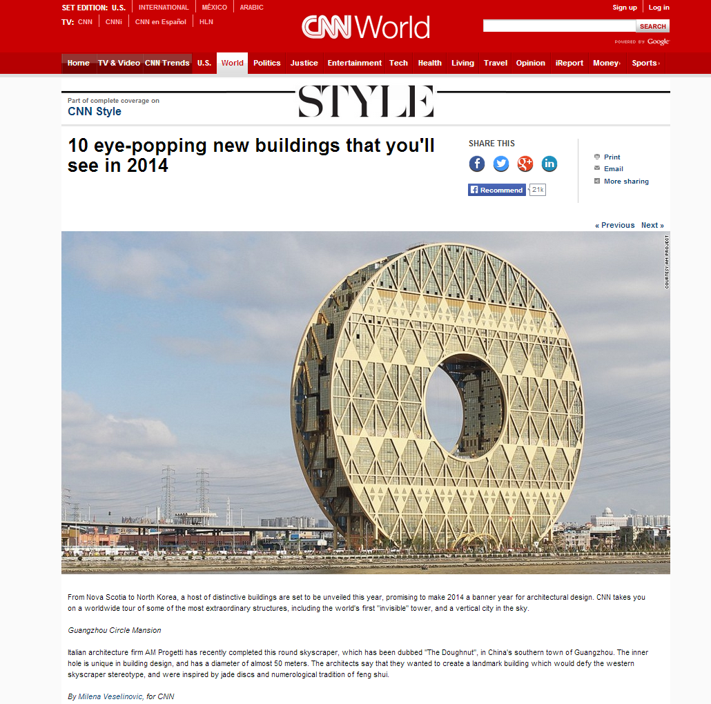
"The Inner Hole is Unique in Building Design" Has she never seen a courtyard? Also, Building Design?
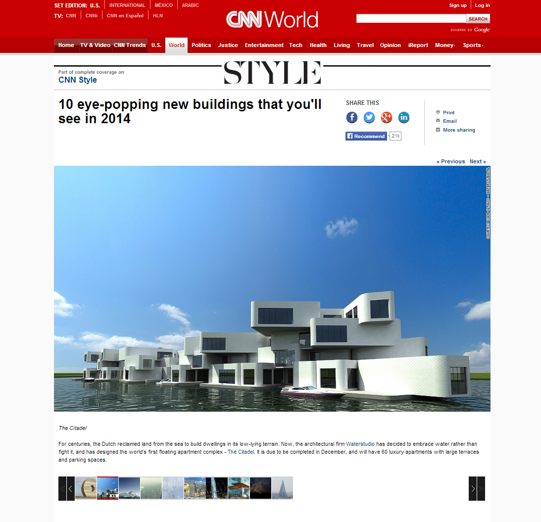
"The citadel... has decided to embrace water rather than fight it" Treating the water as a datum and floating the buildings on top doesn't seem like making a choice to do either.
So we're starting to get a story but we have these big claims that the reporter doesn't back up.
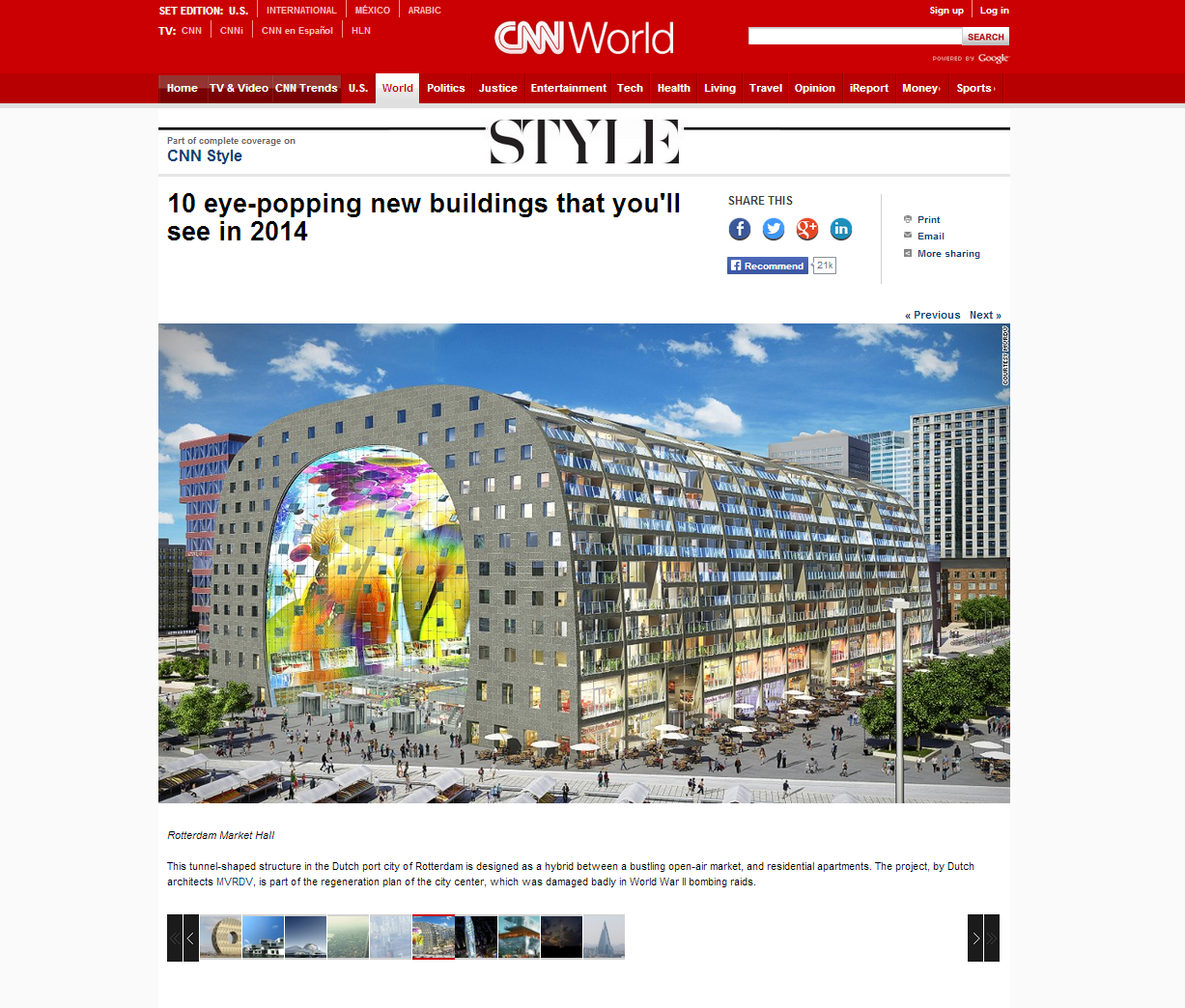
"Designed as a hybrid between a bustling open-air market and residential apartments..." This one starts off pretty well, "Part of the regeneration plan of the city center, which was badly damaged in World War II Bombing raids" but the rest of the description is about post-war Rotterdam.
CALL ME A SKEPTIC, BUT I DON'T THINK ANYONE WALKED AWAY FROM THIS ARTICLE WITH A BETTER UNDERSTANDING OF ARCHITECTURE AND WHY THESE BUILDINGS LOOK THE WAY THEY DO.
So there are a few things happening here, CNN published this and it got a ton of traction, despite how much it lacks in content people are interested. Judging by this, the Journalist seems to have thought she did it justice and the 21 thousand people that shared it. For us this notion is silly-- how could years worth of work be condensed to a rendering and a few sentences. All of these are lacking a context, the notion of an expertise, and a reason. Unless the reporter was trying to say that MVRDV's Rotterdam Market hall looks like a bunker because of the tumultuous history of the site, I'd say that at the end of the day, what we're missing is the story.
Narratives are historically the most comprehensive way to explain something to a broad audience. look at Aesop's fables and Grimms' fairy tales; great at getting many ideas across.
A more recent equivalent of storytelling prowess has been exhibited in video games and graphic novels so I'll be referring to those to provide some insight on engaging contemporary culture specifically.
By allowing the audience to find something they can grasp onto and letting them relate early, they are able to empathize and understand different scenarios with more impact. Many of our design choices are justified through stories of precedents and speculations.
Whether the focus of our work is about sustainability or a mastery of detailing, every project reveals a narrative. The challenge of Architecture is relaying those stories symbolically. Alberto Perez Gomez pins down exactly why our field needs this. The execution and representation of a concept should both hold symbolic weight.
“For Architecture the difficulty of manifesting a symbolic order is necessarily double since it concerns both the project and its ‘Translation’— an unfolding that is seldom present in other arts.”
Ohio State's MARCH exit review process is hinged on explaining what we have mastered through stories about what we've learned. Everyone is telling their own story, even if we have some of the same slides. The only reason we make drawings is to relay information about our design to others. I want to relay the symbolism of my projects to a general audience with the same amount of care that I put into making details for a contractor.
THIS SPARKED THE QUESTION: WHY DIDN'T THE EVOLUTION OF THE INTERNET COMPLETELY CHANGE ARCHITECTURAL REPRESENTATION?
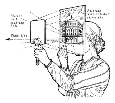
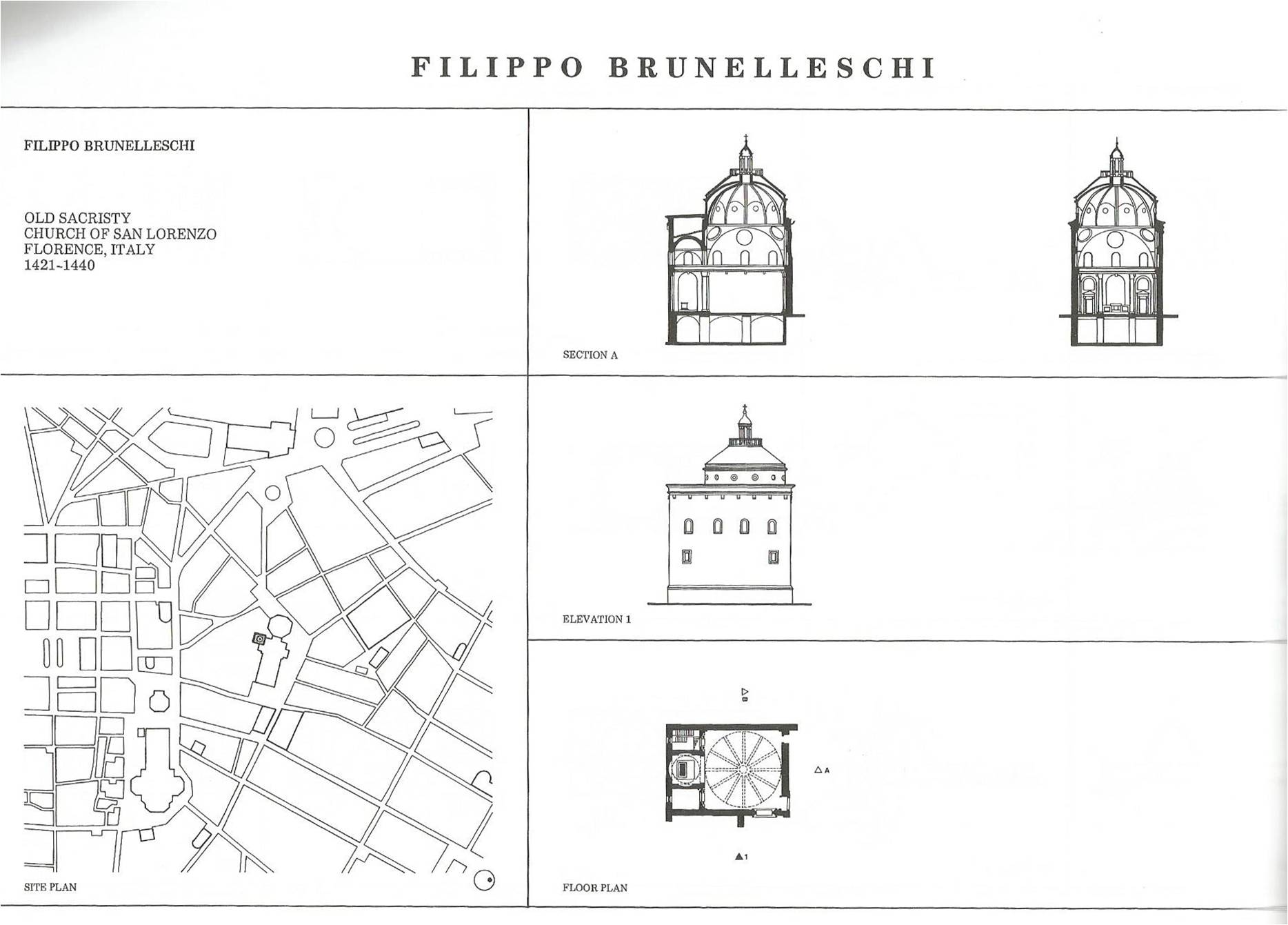
In 1420, Brunelleschi, pushed by an increasingly analytical culture, redeveloped the one point perspective.
He literally invented a way of drawing so that people could see from his point of view precisely.In order to prove his mastery, he set up this apparatus which allowed the viewer to compare his drawing to their view of the Florentine Baptistry side by side using a mirror. The reaction was not hinged on a previous knowledge, it was proven to the viewer via the mirror.
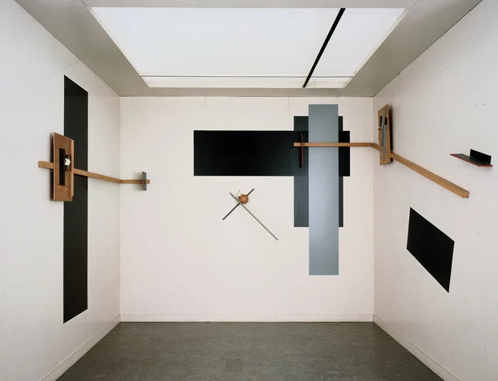
Proun Room, Lissitzky 1923
Lissitzky pushes this concept of engaging the viewer one step further by creating the Proun series. These serve as a bridge between Architecture and Art.
The set of drawings is then experienced by a room built to act as a machine for viewing variations of these drawings. The objects are built and work as an interactive way for a person to compose the view as an artist would.
In 1960, Archigram used Pop Art to bridge the gap between critical and accessible representation.
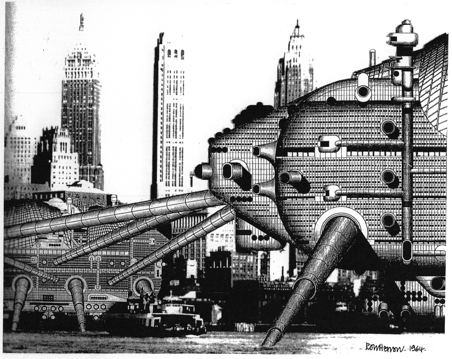
Walking City, Ron Herron 1964
The focus of their work is to portray an outlandish idea as an architect would, instilling enough confidence that it could be built no matter how challenging it would be to actually construct.
The representation is tailored to greatly impact a general audience, which is something Architects are still grappling with today.
Our culture has latched onto the computer generated rendering, but it relays a shallow understanding of the project. If the project can only be commented on in terms of finishes or form, the means of representation is selling it short. I understand that renderings may dominate the conversation between the Architect and the Client, but a digital or universal presentation could benefit from a "behind the scenes look".
“The illusion that you are creating architecture while you’re making pretty drawings. Fundamentally, architecture is something you build and put together, and people walk in and they like it. But that’s too hard. Pretty pictures are easier.
”
Architects have always struggled with the crutch of the “pretty picture” as discussed by Phillip Johnson. In his essay, the Seven Crutches of Modern Architecture, Johnson tackles the idea of using artistry to disguise shallow concepts.
Trying to describe everything in one picture either dilutes the argument or overwhelms the viewer.
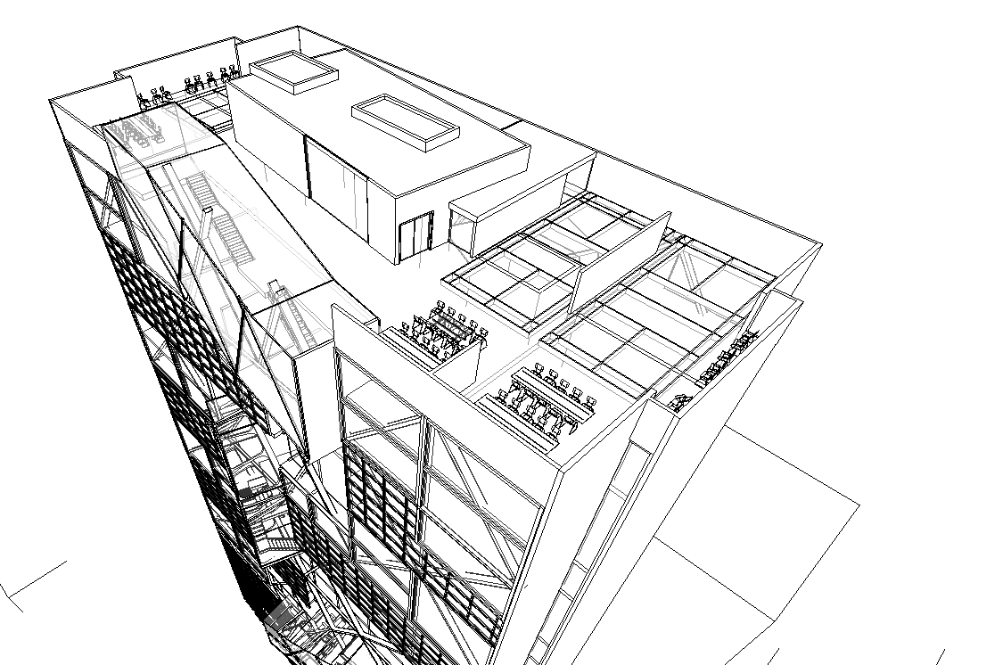
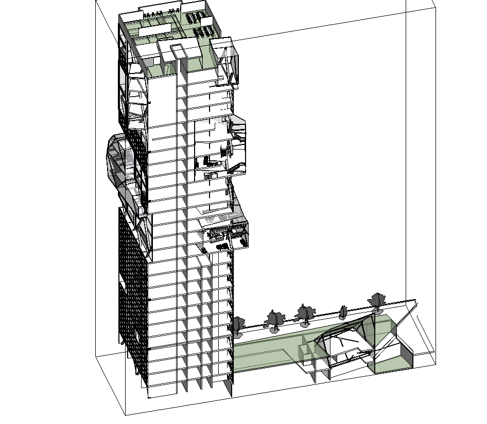
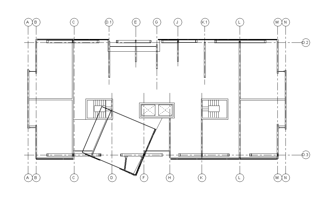
Architects produce so many drawings which use fine tuned graphic conventions to accurately display complex 3d spaces.
Incorporating our concepts back into how the project is represented demonstrates our own understanding of it, which is growing increasingly important when working with newer more complex geometries.
Architects are valued for their ability to creatively solve problems spatially, not how well they can draw, model or photograph.
“To gain something from common place is nothing new: Fine art follows Folk Art”
This is where videogames start to come into play. The videogame is actually really good at two things, mesmerizing the player and telling stories. As Robert Venturi and Denise Scott Brown have mentioned while studying vernacular architecture.
The concept that a virtual building, perpetuated by a video game could get more traction than an architectural design proposal by an expert is alarming. So what's the take away? Architectural renderings aren't pretty enough to captivate the attention of viewers or we're not using an engaging way to get our ideas across? I'd venture to say the latter. We could start using narrative qualities from games to help choreograph how a viewer experiences our work.
As mentioned in Learning from Las Vegas, there's this weird overlap where "space" is no longer the essential ingredient that separates architecture from other arts.

Artists have been able to create interactive spaces in videogames and movies as a means of completing an atmosphere. These virtual buildings pull from history, mythology, and fiction to mesmerize the player and pull them further into the story.
Most of the engines we use to render today were pioneered by entertainment industries. Due to this fact, video games and movies have pushed it past the point where Architects start to see diminishing returns on time spent. As a result a games like Bioshock have a more artistic ... "prettier" environment.
The pitfall of game environments is how spaces interact, as we can see in “Sandbox” or open world games like Skyrim. They will typically prioritize the visual over the space created and things don't hold permanence as a totalizing design.
This building is called Jorrvaskr it's the headquarters for some warriors so it looks like a Viking War ship. Sweet! I wonder how they would do that-- how does light penetrate through the holes in the top? What does it mean to have the insides of a boat as the interior of a hall? That could be really exciting--but it's not.
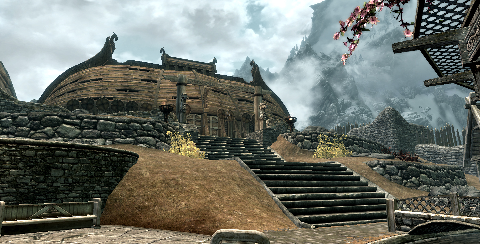
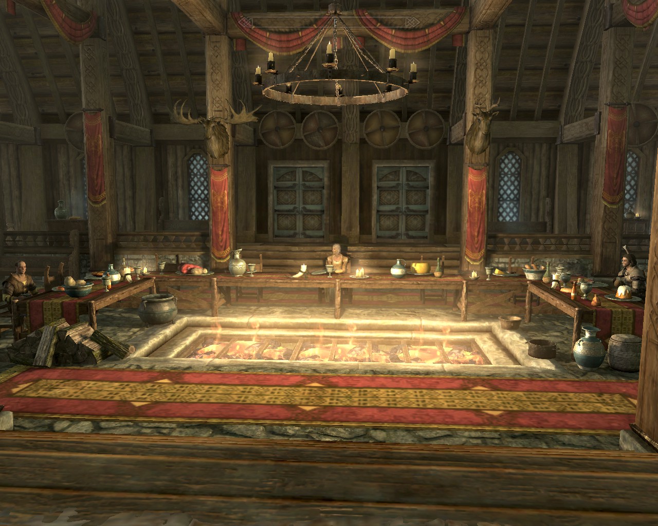

It's a completely normal looking hall on the inside. This happens because they're two separate 3d models in the computer.
WE'RE SEEING A UNIQUE MOMENT WHERE THE VIEW IS UNASHAMEDLY OVERTAKING THE SPACE.
The outside model looks like a building, but it’s really just a building shaped shell. Thanks to a front door which triggers a link, a loading screen, and a new environment, the exterior only needs to have a slight correlation to the interior. Since these are only temporary it's easy to trick the player into thinking the space is more substantially designed. Capitalizing on the limits of rendering, game environments can gain visual interest by being unfathomably complex in superficial ways.
The separate models and action oriented plan are derivative of the movie set school of design.
The movie set is designed with efficiency in mind. The architecture of the environment is allowed to be partial. Without an obvious tell, the viewer will attempt to stitch the world together.
To become familiar, Architectural renderings also use this tactic. A single point of view is used in order to focus on a portion of the building. Which, as it turns out, serves better as a way to look at materials than a way to look at geometry.
But what if we looked at how the controllable point of view can be used to give a better depiction of a building? Our 3d models could be navigable and start to show a variety of lighting conditions or material affects as the user goes through the model.
Architectural renderings serve as visual aids, which show the building, surrounding landscaping, and an engaged site, to help the Architect talk to the Client. The rendering can be tailored to match the tone of the discussion. A collaged rendering with 2d and 3d elements conveys the intent to collaborate and willingness to change aspects of the design. A rendering with a high level of finish portrays an attitude that the design is complete; "the building will look exactly like this".
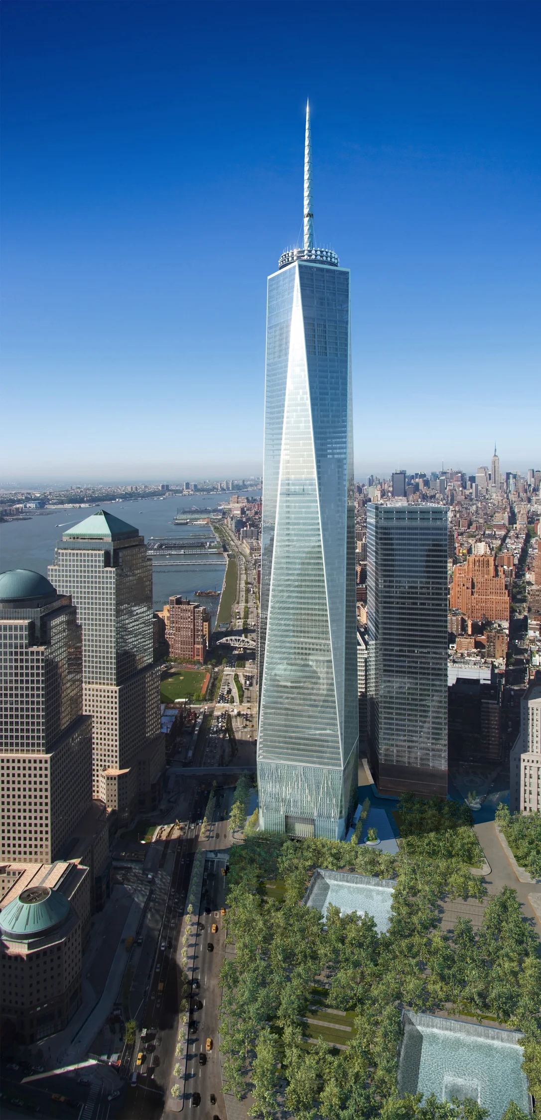
One World Trade Center, SOM, 2013
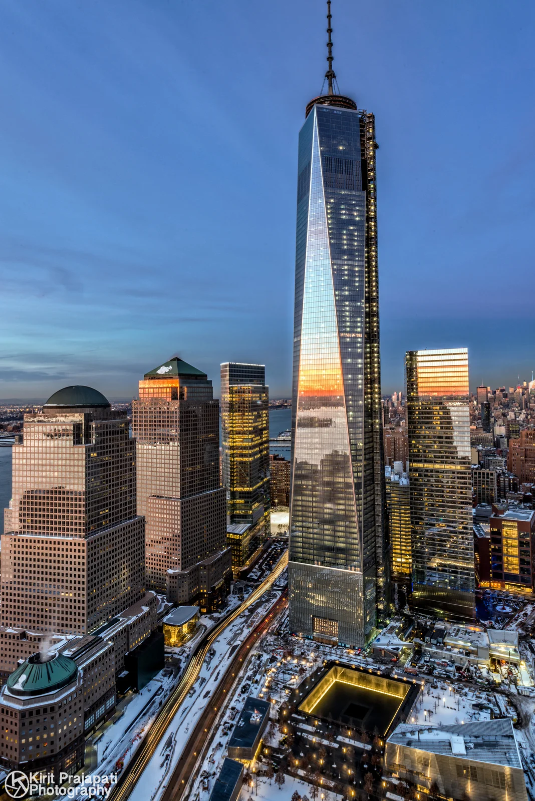
A lot of time can be put into making a rendering look like a photograph, this doesn't help the final result of making a building though. If SOM's rendering was any more photorealistic or had an atmosphere, it wouldn't explain why the facades taper and it wouldn't change the way the building was constructed.
The architect's next step is not to become a better artist, I'd like to find ways to get better at communicating ideas.
By creating a multitude of drawings of varying scales, views, and locations , we end up with a rich understanding of what the building looks like and why. The entire set is daunting to see at once but with certain selections, it is invaluable to visualizing an idea. Renderings give a very accurate snapshot of a project, but without supporting information, it's challenging to appreciate the single moment.
One of the ways I could see solving this problem could be realized in the navigation of the website for the project. What if you started with a plan and used the section markers or camera locations as links to those corresponding drawings. By using the way an architect makes his or her way through a set of drawings as a precedent, line drawings can start to be familiar to a general audience like a "map". Kind of like how Revit is inherently organized, which happens to be a surprisingly non-oppressive side effect of the program.
The programs we use to design like AutoCAD, Revit, Rhino, and Sketchup, have drafting tools as well as plug-ins which render three dimensional designs. The process is more or less streamlined to reward a good set of drawings with a decent 3d model.
artistic and architectural renderings are inherently different. Architectural renderings excel by portraying information. Artistic renderings strive to create an environment.
For the artist, the pinnacle of the work is the art. The architect uses renderings as a tool for visualizing what the build environment could look like. This does not describe the project in its entirety, but does a great job at anticipating views. textures, and massing.
Studio V's recent winning proposal for the Stamford Transportation Center is a good example of what I would consider to be a typical digital architectural rendering. There's a building, engaged in a site, blue sky, glass, and lots of vegetation. Since Studio V does not have a website, I'll be using Arch Daily's coverage of it to discuss the project.
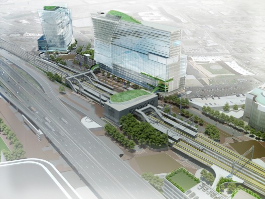
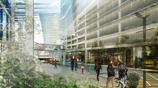
On its own merit as a rendering, this image is not impressive to an audience which is accustomed to seeing digital renderings. Remember how I was talking about the 2d post processing? It causes a contrast in precision. So you get these weird errors such as the sky in the background being different than the sky that lights building. The context modeling doesn’t meet the horizon line which is continued by a raster image and doesn't even line up from the left to right sides of the drawing. There’s a partially deleted piece of infrastructure on a power point. And the icing on the cake is the foreground that consists of two different points of view.
An architect with a good grasp on cost/benefit relationships will understand when and where to use shortcuts. This rendering is for a competition, the project isn't meant to be built as is, so the trees can be generic at this point. Certain aspects seem to be exaggerated, but it appears to be used to support the overall idea of energizing the area. As a rendering used to discuss an architectural idea, it's also rather weak.
Using renderings to represent this project capitalizes on the weaknesses of the design.
The resultant presentation was developed to impress a consumer audience. So now it's in competition with artistic renderings, with the lack of totalizing geometry, it only takes credit for developing a cool shape and an atrium. By providing drawings, we're giving the viewer enough information to come to their own conclusion about whether or not the design is good instead of leaving it up to the visual. It's not like it's hand drawn. Why were line drawings sacrificed to get 3 very similar exterior drawings and a non-descriptive interior. Geometry falls into the realm of plan and section as far as architecture goes. The vertical edges are so subtle that the only renderings which can describe it are long shots. Renderings are great at describing lighting and materials but this building in particular does not use a variety of materials in the facade.